
If you consider how many documents exist in the world (over 2-5 trillion Word documents estimated globally), and how many of them are likely to be forms (templates used to capture data), the next question is then, how many of them are poorly formatted?
Pitfalls of poor form design
If you have poorly designed forms, either internally, externally or both, some of the issues this can cause are:
- Inefficiency
- User fatigue
- Abandonment
- Frustration
- Damage to company reputation
- Low information accuracy
We all know the struggle, you need to complete a form for some reason; job application, tender proposal, appraisals etc. With this being a universal experience, we have listed below what can make a bad form.
What makes a bad form?
A poorly designed form may have the following characteristics:
• Too many entry fields – can cause user frustration
• Poor layout – critical information either not readable or poorly positioned
• Accessibility issues – inadequate font size
• Company information not visible
• Cluttered design – difficult to complete
• Unclear purpose
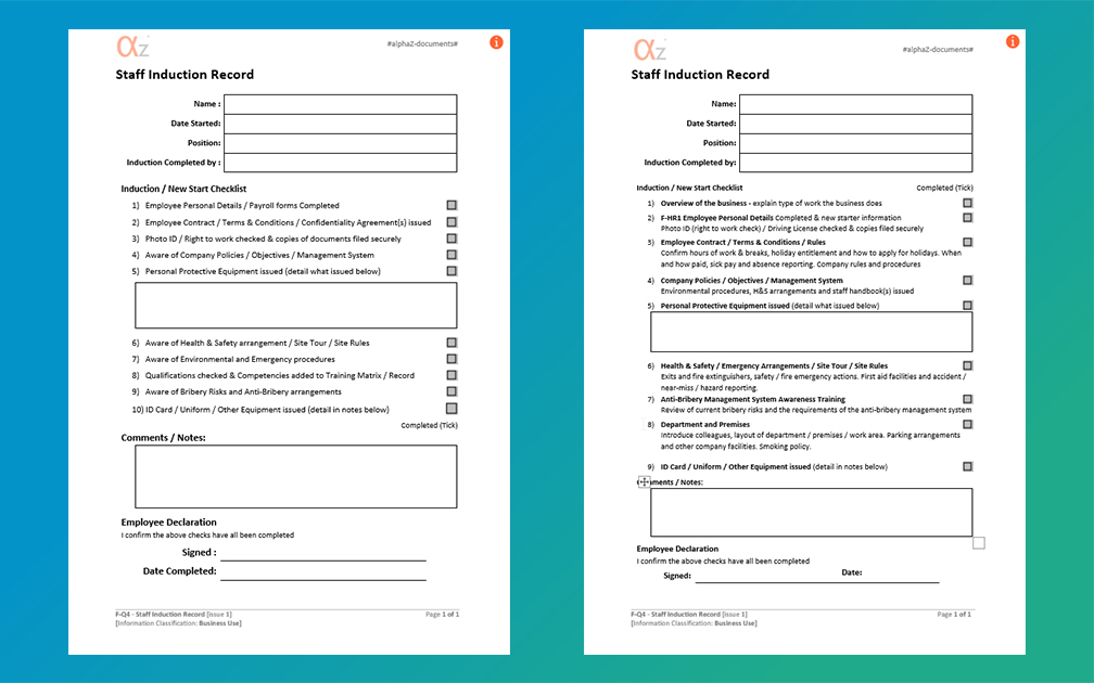
What makes a good form?
Good form design should incorporate a number of good design principles, so that those completing can easily submit the required information without frustration, abandonment and missing information!
Here’s what makes a good form:
• Logical section headings
• Progression from general to specific information – general notes and comments left as a summary at the end
• Related fields and information grouped together (e.g name, address, postcode, mobile number, email, date of birth)
• Sections kept concise and focused
• Equally aligned margins and appropriate spacing
• Use of dropdown lists for efficient selection
• Colour coding for ease of reading

Recent example of form transformation at alphaZ Documents
A form which was being used by one of our clients, downloaded from a government guidance website, had the purpose of logging the inspection and maintenance of RPE (respiratory protective equipment), was seen to have a number of these aforementioned pitfalls:
• Redundant fields – too many unused sections
• Titles in column headings – causing clutter
• Company name required – this should already be in the header for all company documents
The form got a full makeover, in alphaZ fashion, including:
- Clean and only strictly necessary header fields
- Redesign of the check logging section to remove redundancy
- Switch from Landscape to portrait layout (enabled by the more efficient table design) which allowed the form to cover 12 months of checks
- Fields added for details of maintenance to be documented and records retained (both legal requirements)
A few other aesthetic and user-friendly changes were made, full details here: File Updates Blog - New file listing - F-HS44 RPE Monthly Inspection Form.
Additional points to consider
Forms may be used to capture sensitive information such as personal details including banking information, addresses, medical information and the like, so its important to consider what will be done with this data. See our other blog on this topic for more information.
alphaZ Documents form templates make use of all of these best-practice principles, so you can be sure that you have access to the best forms around.
We are always reviewing and updating our content to ensure it is practical, readable, user-friendly and well-designed.
View our Forms section for an overview of all Form Templates available.
Keep an eye on our File Updates Blog for updates on all improved and new documents.
Published: 25th March 2026
